LearningWell
Improving mental health in higher education
LearningWell is a digital magazine dedicated to new ideas and perspectives on higher education and life-long wellbeing. The publication strives to bring a vast array of voices to the conversations that drive student mental health, higher education policy, institutional decision-making, and inclusive excellence in order to “help young people live and learn well.” Decimal partnered with LearningWell to create their brand identity and digital magazine.
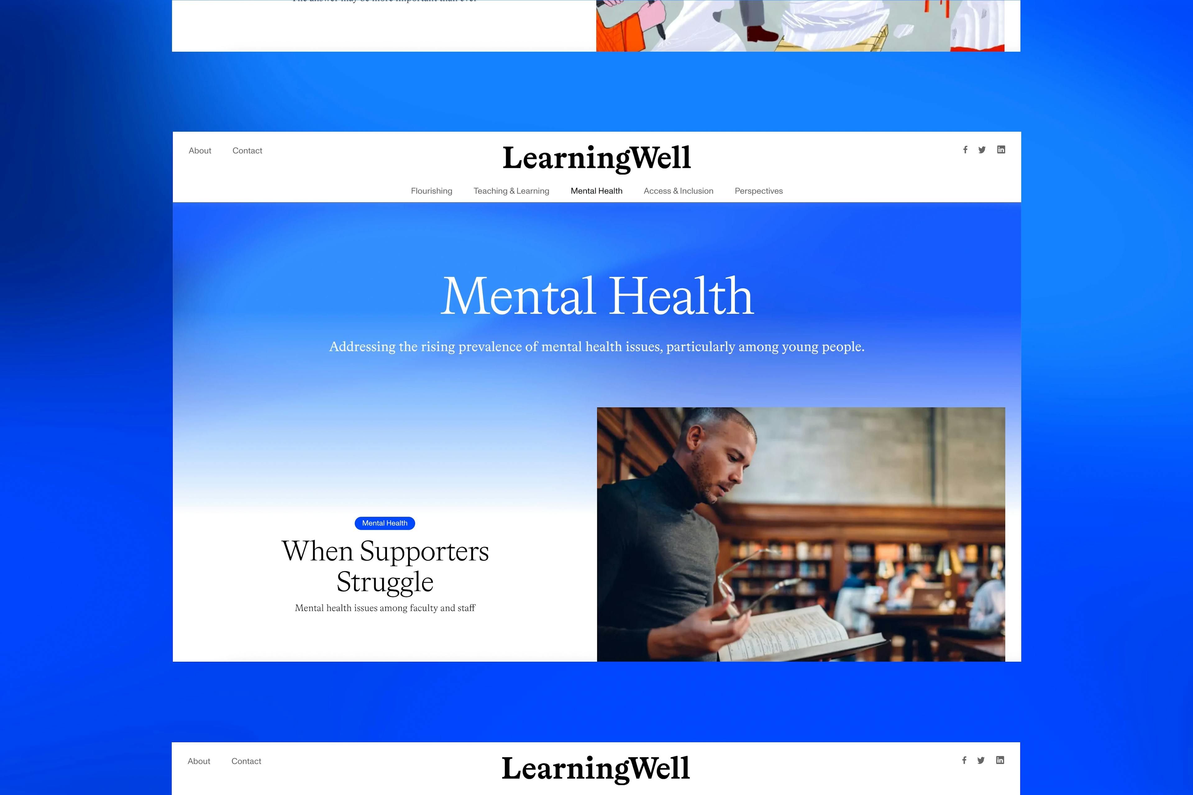
Positioned for change, built for growth
Published by the Coalition for Transformational Education, a leader in the charge for positive change within the mental health space in higher education. With constantly updated and evolving content the magazine invites a growth mindset for the field by providing space for various approaches to life-long well-being and fulfillment as promoted by colleges and universities across the country.
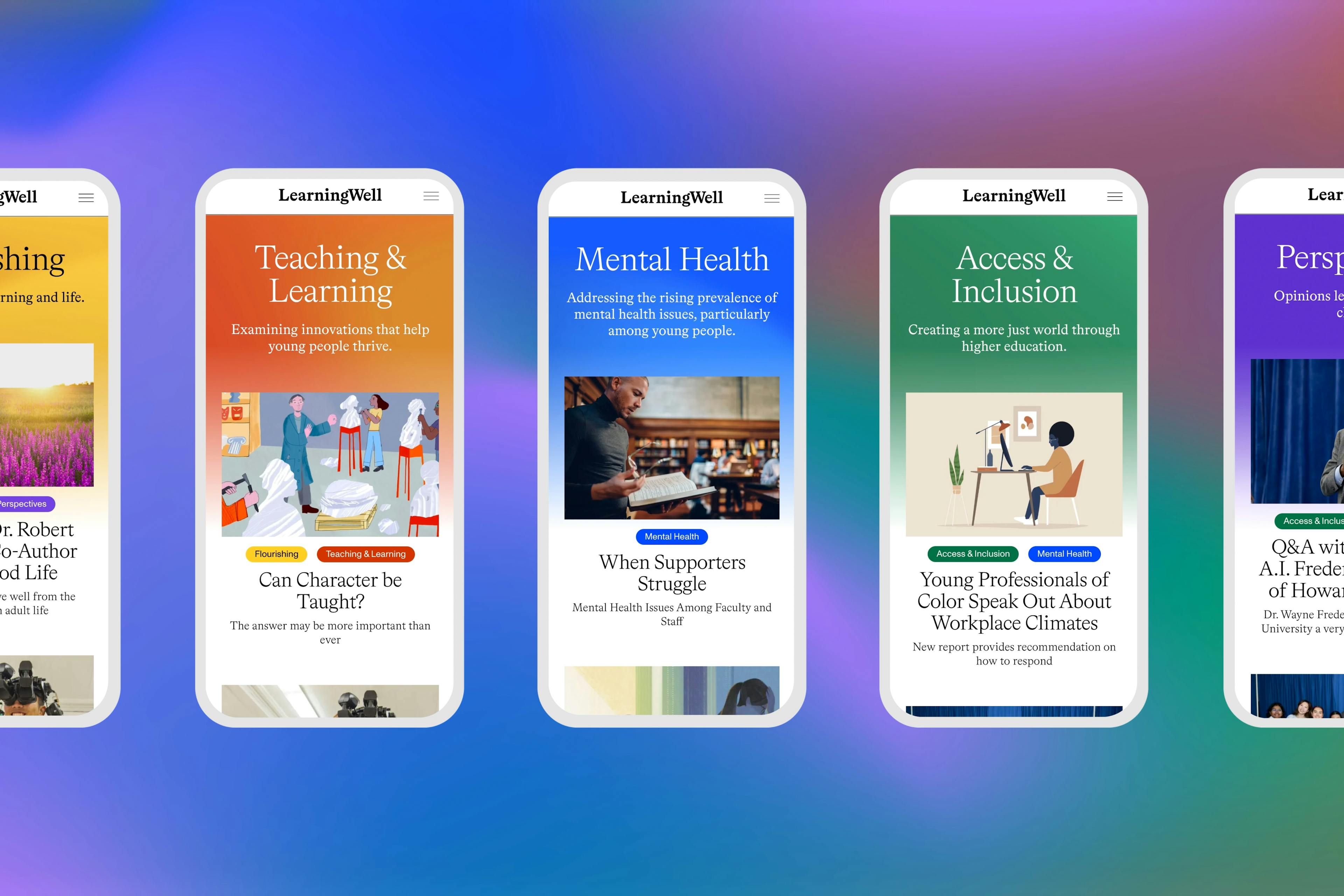
Communicating through color
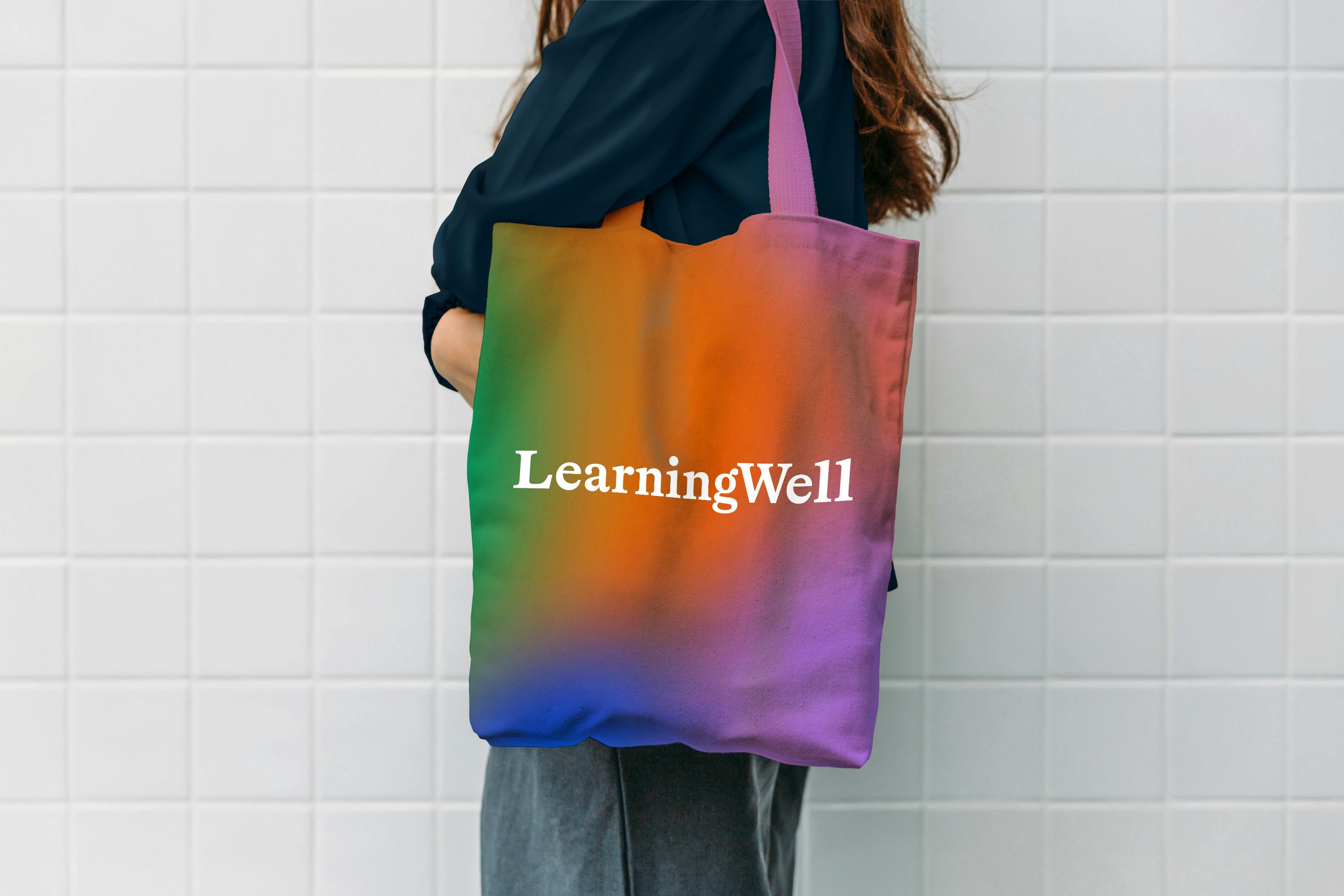
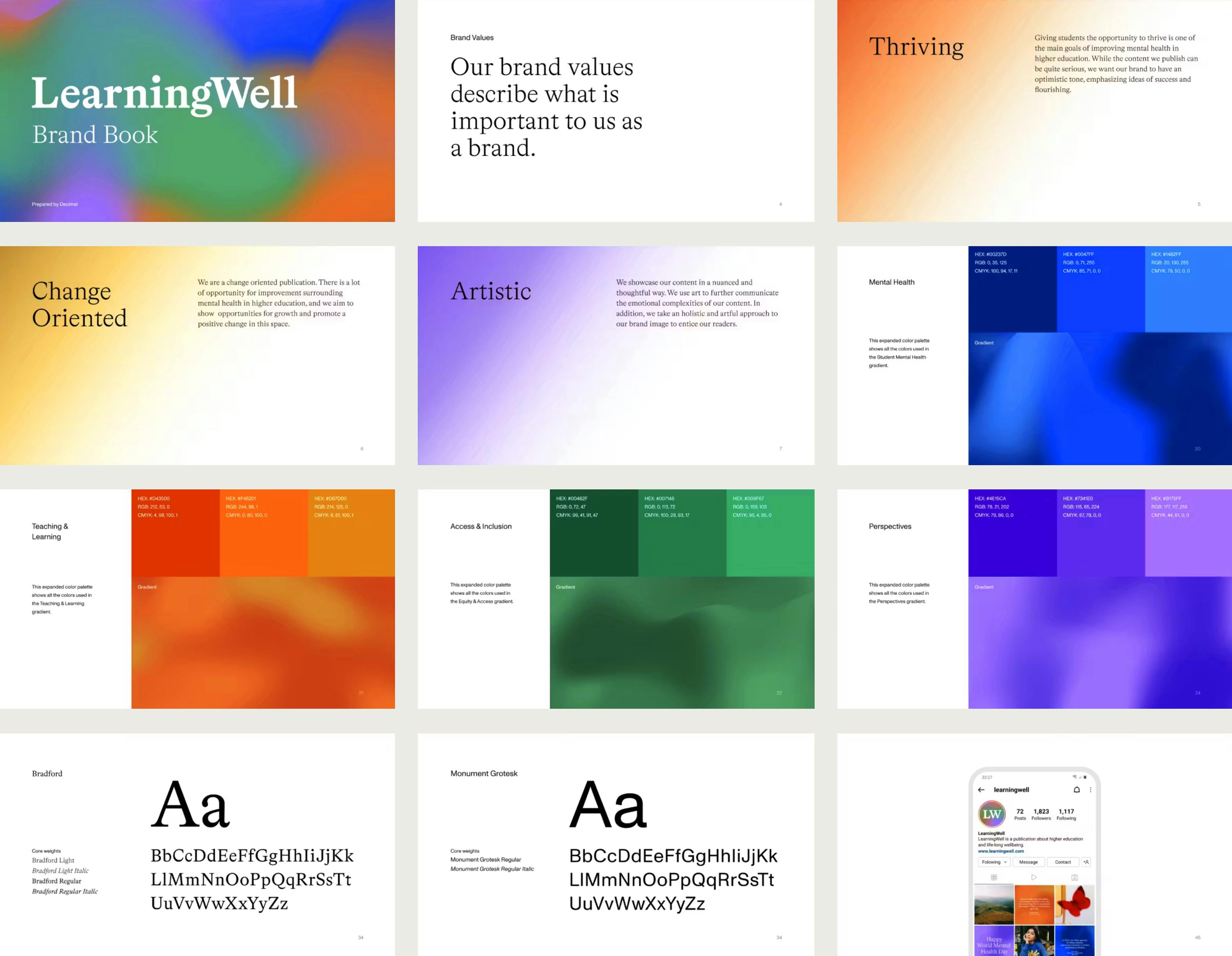
Each color of the bright, bold palette reflects the optimistic tone of LearningWell. Working closely with the client, individual colors were chosen to represent different themes, allowing users to easily identify important topics within the various sections of the publication.
By using gradients we sought to subtly communicate the transitional nature of higher education’s relationship to mental health. Generating dynamic gradients with code allows the site’s foundational colors to move organically, amplifying the constantly evolving state of well-being within the educational system.
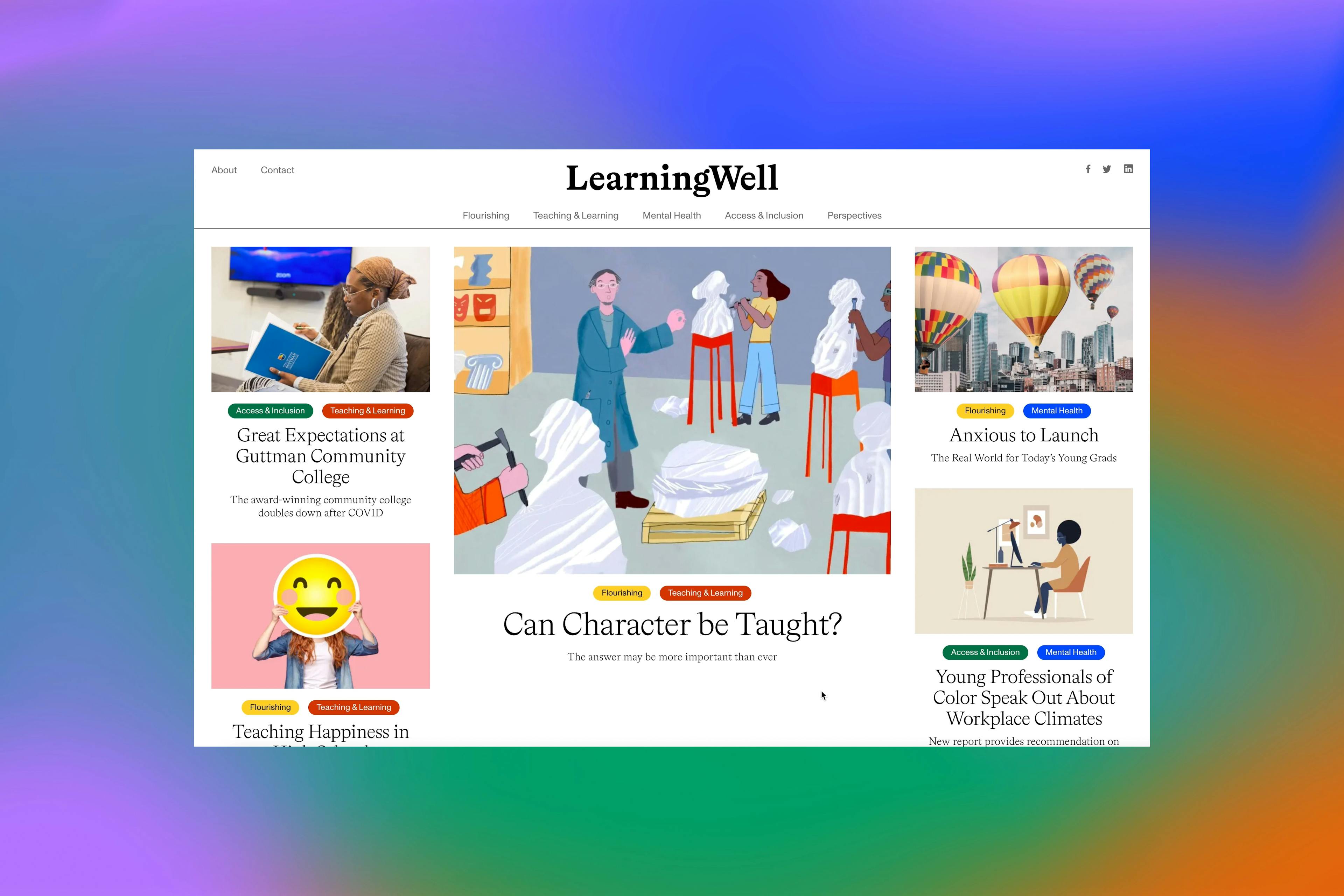
Designed for difference
To accommodate various content types we created a flexible design system, allowing editors to use different templates and modules to effectively manage and make the most of the assets they have — videos, photographs, copy, pull-quotes, headlines, sub-heads. The result is a media-rich site that is easy to navigate and even easier to operate.
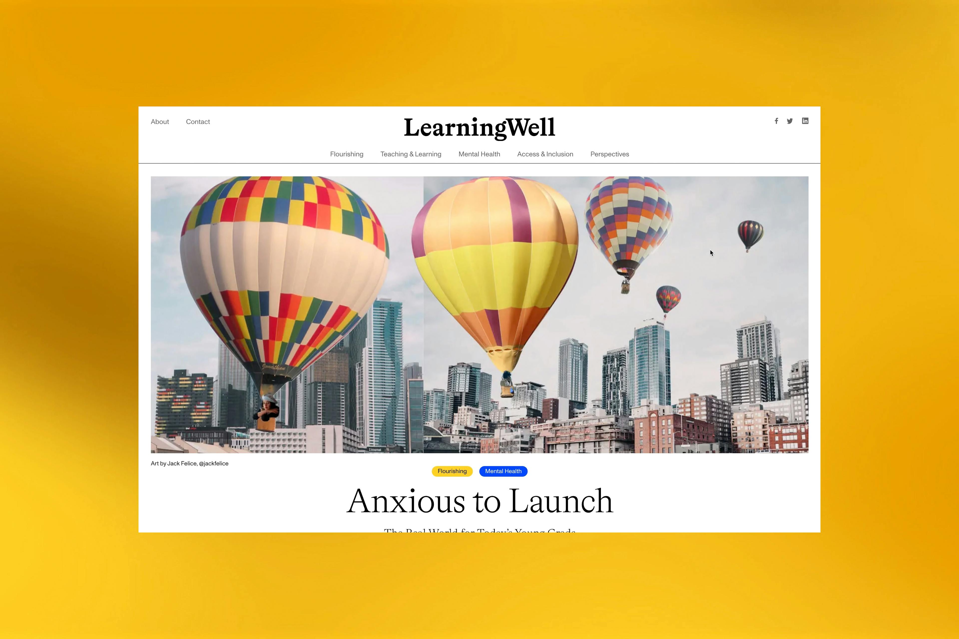
It was extremely important for us to launch our new magazine with a powerful visual platform and Decimal 100% delivered on that. The end product was beyond our expectations.
Marjorie Malpiede, Editor in Chief
Expressing optimism
The custom logotype and typographic choices reflect the positive, warm voice of the magazine, creating a compelling juxtaposition with the often quite serious subject matter. The design decisions paired with the thoughtful content have created a colorful experience that emphasizes success and flourishing in all aspects of life. Bradford was chosen as the primary typeface for its beautiful details and legibility. Monument Grotesk, a simple, modern typeface is used mostly for navigation and secondary elements like captions and tags.
Decimal
- Alfredo Gago
- Kevin Blanco
- Kirsten Holland
- Gabrielle Harlid
- Guillermo Brotons
Type Design
- Letterjuice
LearningWell
- Amadeo Rodriguez
- Anna Milrod
- Dana Humphrey
- Marjorie Malpiede
- Mollie Ames
